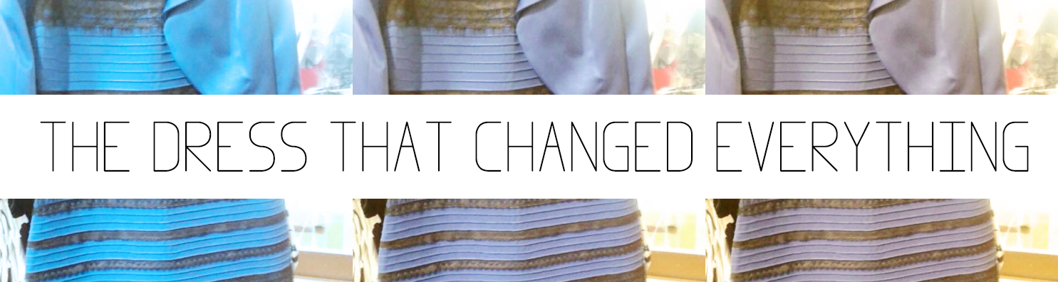
Preface
I know this post is rather long, but it was so intriguing to me that I just had to go into full blown detail as to what's happening with this internet phenomenon of the color changing dress. If you don't really care about all the mumbo jumbo of how your brain, eyes and cameras work as well as color theory, subjectivity and perception, you can just skip to the bottom and have all the answers to life. Actually, I don't have the answers to life, but for some of you who are in a conundrum because of this photo, it may just feel like it.
Civilizations Will Fall...
That's what it felt like after I came across a particular web phenomena today where the internet seemingly broke. While at first I believed it to be some kind of joke - I started to realized after reading through comments and various websites how this simple image has put so many people in a complete life-changing crisis. This photo is that of the blue... er... white-ish... and, black... maybe gold - dress. It seems to be a pretty even split of 50% of people on the blue and black fence, with others on the white and gold fence. One man even said his daughter saw green and purple, but thankfully he is rushing her to the ER now to have her brain checked by doctors.
Here is the photo:

Several people say its changing colors in front of their eyes, other say it changes each time they look at it. A few people believe this is some sort of conspiracy by the Illuminati, and others have given up on life entirely after coming to the conclusion that it isn't even real life, and perhaps we all just live in the Matrix anyway. There is no spoon they say. Well, I'm here to use my knowledge of light and color to help save those people from themselves, and possibly give a little insight to those who are in less of a crisis but are just curious as to what all the fuss is about.
Just so you know a little bit about why this intrigues me so much, it's because 90% of my life revolves around images and color. I am both a professional cinematographer and film/video colorist. I have trained my eyes for over a decade on color theory, lighting, and both the technical and creative sides of photography and color correction, so a predicament like this made me pull out my measuring tape (actually, color picker in my case), and get to work to solve the mystery!
What is Reality, Really? I Mean for Real?
Don't worry to those of you stuck in the Matrix right now, these aren't some quantum mechanics or existential theories I'm talking about here. So hang in there, we'll get you out of the rabbit hole soon. To understand what is going on, you have to understand four essential concepts:
- Objective Reality
- Subjective Reality
- Objective Representation
- Subjective Representation
These concepts are merely about measured light waves (objective reality), perceived light waves (subjective reality), measured data from an image (objective representation) and perceived data from an image (subjective representation). I will go into further detail later, but I'll quickly break down the four categories as they apply to this discussion.
- Objective - Raw measured color data sampled in a controlled environment.
- Subjective - How things appear to the naked eye in context to the surrounding and known information.
- Reality - Do I really need to explain this one? Objects (or colors in our case) in the tangible world, which are photon wavelengths.
- Representation - How real pigments and light waves are captured and represented through a camera sensor and displayed using pixels on a monitor.
Tying in these four categories are two main components we must also understand - our eyes, and a camera sensor.
The Eyes Never Lie
Okay that's not true, maybe other people can tell if YOU are lying through your eyes, but our eyes "lie" to ourselves on a regular basis. Actually, that's not entirely fair. Our eyes are essentially measuring devices, and while quite accurate, they are tied into one important organ that can really screw things up for us sometimes - our brain. This is why what we see is completely subjective. Our brain doesn't feed us raw data since it would be quite useless to us. Our brain takes raw data and converts it into usable information - much like that of a computer - so that we can process it and make decisions.
During this conversion process, our brains do a lot of behind the scenes work without our input to try and compare things based on past experiences, knowledge, and emotions. Although generally everyone can come to the same conclusion when observing an object, except those rare few (such as the girl who saw pink and green) there are certain scenarios which can throw people in different directions, essentially creating an optical illusion. Let's break this down.

What color is this woman's face? It's most certainly red, right? That's probably what a very young child might say before they know what face paint is. What color is her face really? What is that question even asking? I mean, I could use photoshop to tell me it's red. I could measure her face in a controlled lighting environment, and compare with calibrated swatches, which also would tell me it's red. But I KNOW her face is not actually red. So what color is her face, really? (I'm not trying to start a semantic argument here).
How about this photo:

What color is this man's face? It's most certainly red isn't it? How come my brain is telling me I'm wrong? I can sample his face in Photoshop and get a very similar results as the photo of the woman with red face paint? So what color is each of their faces?
This is where subjectivity comes into play. I know through past experience and knowledge, that the woman's skin color of her face is most likely a light peachy-tan color. Why? Well, I can see she has face paint on for starters, and I can tell by her neck and shoulders that that's the real color of her face (assuming she has consistent skin pigment across her whole body and face).
In the second photo, through my knowledge as a photographer and colorist, I believe there is a strong red light projected on the man's face. So in real life, red wavelengths bounced off his face and into the lens of the camera (or eye if you were standing there). His skin color could be light or dark, but it's definitely not red.
These examples are subjective based on the knowledge of the viewer. Because with no knowledge, we would just say both people have red faces. After all, that's what we see and we can measure it using the eyedropper in Photoshop.
I Think I Could Get Used to This
This is where the color changing happens and why each time a person look at the same photo on the same monitor, their perception of the colors can shift. In a camera, you have to manually set the white balance. What this does is compensate for the tint of the light in the blue/orange direction so that the colors of object render on the image correctly. The K stands for Kelvin which is an objective measurement of light wavelengths. Also, when you are talking about Kelvin you have to call colors "colours" and speak with a British accent.

Right-o! For example, if you are outside, the light is about 5500K. Now, if you keep your camera's white balance set to 5500K, and then go inside where the household bulbs emit a light wavelength of about 3200K, everything will appear extremely orange. Even blue colored objects will start to appear orange, because the light is shifting the colors so dramatically. Your eyes, as opposed to a sensor, do not need to be "set" to white balance. They slowly adjust automatically to balance things to neutral white, so that you can see colors as objectively as possible under various lighting scenarios. To see an effect of this, wear "blue blocker" sunglass which are tinted orange for about 5-10 minutes, then take them off and suddenly the world is blue!
Your eyes are always doing this, trying to compensate, and depending on how your eyes are adjusted, the same thing can appear different colors each time you look at it. In my profession, this happens all the time. Your are trying to match two shots of a film, and something feels wrong about one of them. Maybe the lighting changed, or one shot was from a different day. Whatever the reasoning, you will sit on one shot, slowly trying to balance it, "A little more yellow... okay a little more... it's still looking blue, a little more yellow." Fifteen minutes goes by. "Okay I'm not quite there, just a little more... and... PERFECT!" Now go to lunch and come back spit your coffee all over your screen and yell "WHAT THE HELL HAPPENED!? Did Instagram come in here and ruin my movie??"
Nice original color correction.
Disgusting Instagrammy looking movie.
Hold on to Your Pants, It's Going to be a Rough Ride
To go a little further down the rabbit hole with color subjectivity, we can use a few optical illusions to see how our brains can even be tricked when looking at a single image.
Not only does your whole eye adjust to the colors, but your brain can adjust selective parts of your vision on the fly! Check this illusion out by www.planetperplex.com. Look at the baby on the right, each half is a different tint, right? now stare at the cross on the colored squares for 10-20 seconds, then look back at the center of the baby image. Hold onto your pants for this one!

Pretty trippy, huh? How about this next one? Is square A or square B a darker color?

In this image, both square A and square B are objectively EXACTLY THE SAME COLOR in this image representation! Don't believe me? I've done the work for you and removed the rest of the image besides the two squares in question and this is what we get:
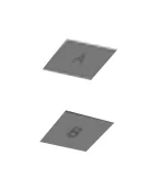

Even Jackie Chan can't believe this one. You're not alone.
Calm down, calm down, you're not crazy. Why do the squares appear subjectively different? This is just a combination of knowledge and perception being used against you. Maybe this is all a conspiracy after all. Your brain is telling you that since the checkered pattern alternates light and dark grey, that B is lighter than A. And guess what, in real life it would be. If it were measured in a controlled environment with even lighting, B would be lighter than A. However, in this instance, the shadow being cast by the cylinder is making the photographic representation of the colors the exact same. I know it's not a real photo, but if it were, the same principles would apply.
Machines Will Rule Us All
I don't believe camera sensors are created by SkyNet to turn us all into meat-sack slaves to the robot race. And if I'm wrong about that, I guess I'll jump on board the Matrix train with everyone else.
Anyway, we need to understand a few basics about the camera sensor. A camera sensor is basically a device which captures light (like our eyes) that has been focused onto it with a lens. Ignoring all theoretical (and actual) imperfections and possible color shifts a lens itself can impose on the light traveling through it, a sensor simply stores raw data of real light waves. Each pixel in a sensor gathers light in a Red, Blue, and Green component during each click of the shutter. However, what you get when you spit that information out, is not an image per say. It's just a bunch of "ones and zeroes". A processor then needs to analyze those ones and zeros and converted them into a color space that computer monitors, tvs, or mobile devices can display so the image represents the real colors and values as accurately as possible. This is called color science.

MMMMMMMMM.... SCIENCE......
Okay it's not brains and goo kind of science, but it's still science. And in it's very nature, it is humans trying to apply knowledge to the best of their ability and understanding. So no, it's not SkyNet machines... sorry Terminator fans. What color science refers to, is the process in which color information is converted from raw data (stored voltages on a sensor) to usable pixel data (displayed colors on your monitor). This means that there is room for error, and not every camera and color space conversion is the same. An example is with the Red digital cinema camera, they release a new color science for the same sensors from time to time, as they find better ways to convert the data from the same sensor.
The point here is that camera sensors and processors which do the actual conversion do not perfectly capture and represent colors with perfect accuracy! This is especially true with lower end cameras. Another thing to take into consideration is not all monitors are the same, so an image can look different across different devices. I, for instance have a very high-end calibrated monitor that represents colors very accurately. But even then, the way our computers work, some browsers and programs will bypass that calibration entirely, while others will use it incorrectly.
Basically I can have one image look completely different on the same monitor just by viewing it in several different programs!
Also, judging by the quality of the dress photo, it was not taken with a camera at all, rather a potato, which I believe has very little color accuracy. Then again I'm no scientist. But I digress.
Smoke and Mirrors
Pigment
Now that we have a fair bit of background of the process of our eyes and camera sensors, let's take a quick look at two important factors that are applying to this image. At the end of the day, if we see red, that means red light is bouncing into our eyes; so when trying to discern the actual pigment of an object we have to try to analyze what all is going on in the environment. If an object is red, and you shine a white light on it, the object will absorb most wavelenghts of light except the red (seen in the face paint photo above). This reflects off the surface and into our eyes and we see red. Now what happens if we shine a blue light on the red paint? Does it become blue? It depends on how much blue you put on it, but likely, the red will always absorb a good portion of the blue and you will get more of a mucky blue tint. The color of the object will greatly impact how a light is reflecting into your eye. Light, peachy skin with white light? You see light peachy color. Red paint with white light? You see a red color. Nice.
Reflectance
Reflectance properties of a material also have a large say on how the light is modified before hitting your eyes. A bright shiny metallic object will reflect much more of the original color of the light source versus, say, a velvet cloth. In some clothes you see this all the time with silky materials that seem to change colors as the angle of light changes. We must take this into consideration while analyzing the photo.
Selective Color Balance
The last important (and probably most important) thing to realize is that once a camera sets it's color balance - the whole image is now locked into that balance. Our eyes like we saw can selectively adjust in real life, but not a camera (without the help of some Photoshop). What this means is that if you have a window with sunlight in the shot (which appears to be the case in our photo) projecting 5500K light in from behind the subject, and then a bright indoor Tungsten light projecting 3200K light directly onto the dress, we have a problem. The camera has to pick one or the other. If you pick 5500K, the outside light will appear neutral white and everything is fine and dandy, but what happens to the indoor tungsten lit objects? You guessed it! All the colors and pigments start to shift orange!

I'm coming to get you, kids!
On the flip-side, if you balance for the tungsten light, everything indoors will appear neutral and the color will render accurately; however, everything outside will start to be very blue. You can only have one or the other when it comes to a camera. Or you can balance between the two, but everything under the tungsten light will still shift orange, and outside will still shift blue.
Now we are getting somewhere. This effect starts to create color bias in various parts of the image - where the hues of the pigments start to shift in a different direction because of the color of the light hitting the objects. This will be a major determining factor in our analysis.
In order to determine the real pigment hues as accurately as possible from a photo representation, we need to balance so that the light hitting the object matches the camera's settings, or is correct in Photoshop. Only neutral white light will render accurate hues.
OKAY, WHAT WAS THE ACTUAL QUESTION AGAIN?
This is really the heart of the problem, and the first obstacle we must hurdle over. Are we trying to figure out what color the material of the dress really is, or are we trying to find out how it appeared in real life at the moment of the photograph under the given lighting scenario? Or are we trying to figure out what color our monitors are representing the dress under the photographic process and lighting that was present, along with any color correction techniques applied to the image? In our case, the two questions are "What is the actual pigment of the dress materials?" or "What color is the photo representing the dress to be?"
This is where things really get confusing for people. Some people are trying to prove the dress's REAL color based on this photographic representation, while others are just trying to prove what colors the JPEG photo's pixels contain. What I am going to do is use color theory, logic, and what little bit of brain I have to deduce what I believe the ACTUAL color of the physical dress is if measured objectively in a controlled environment. In other words, I'M GOING TO GUESS WHAT COLOR THE DAMN DRESS REALLY IS.
My Brain is Starting to Hurt
Okay, okay let's get into it! Now we know what we're asking:
What color are the pigments of the actual dress materials? (Objective Reality)
I did a little bit of objective measuring of the photo (representation) as a starting point:
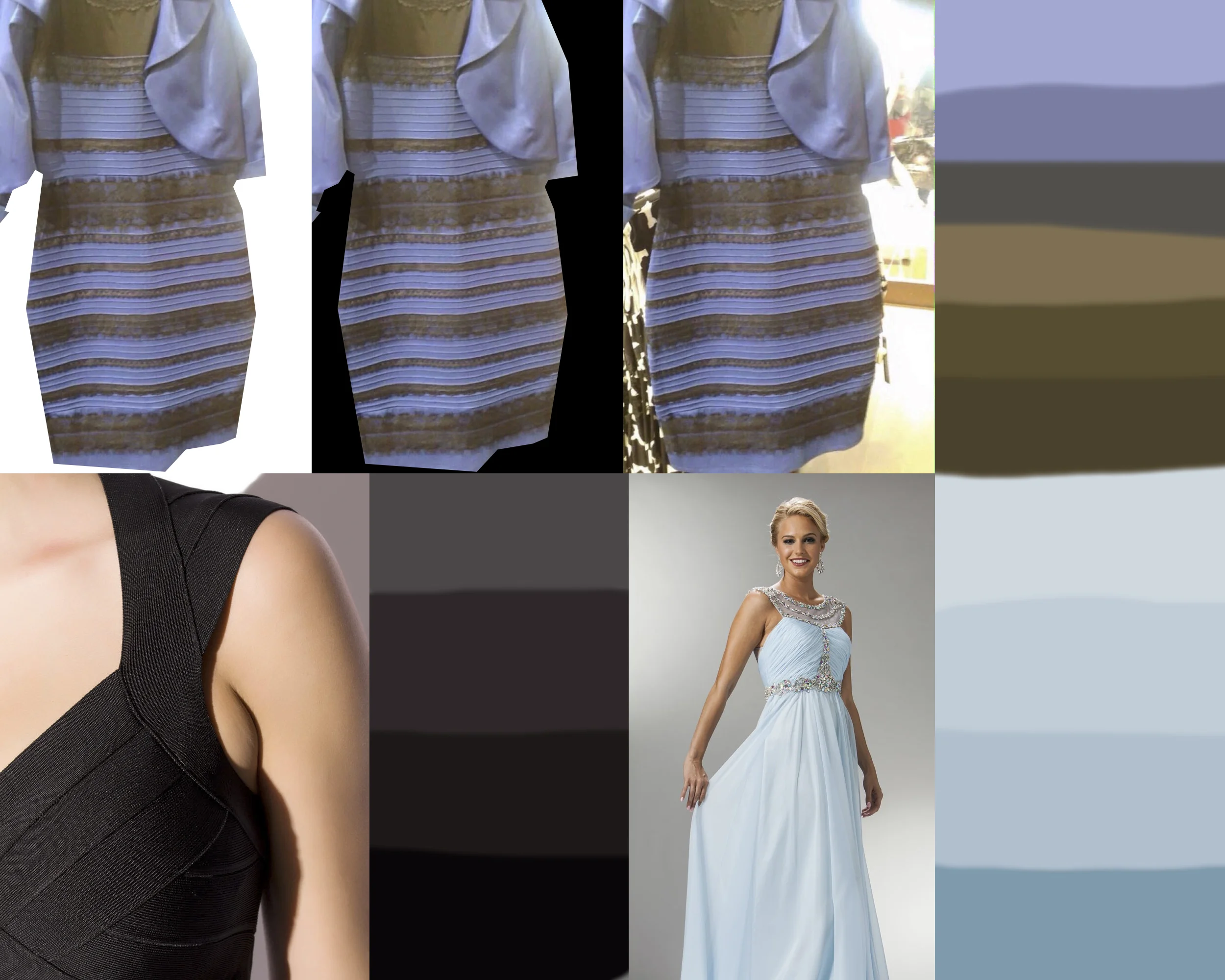
At the top there are three versions plus a swatch sample of the photo:
- Masked on White
- Masked on Black
- Original
I did this to first remove all subjective surroundings that could mislead our brains (proven in the checkerboard illusion above). Next, on the bottom row, I have a sample black dress and sample light blue dress.
I then sampled the range of colors on the white (or blue) section of the dress, along with three swatches of the gold (or black) portion of the dress. What do these swatches tell us?
HOLY CRAP ITS BLU-ISH PURPLE AND BROWN-ISH GOLD! WE ARE ALL WRONG!!
Not so fast there. Remember, this is just the the photograph's objective representation of the colors. It's now time to get into the fun part and really analyze what we think is going on. In order to do this I will apply my knowledge of photography lighting, and color correction to analyze this photo. It's like I'm doing real science! What would my college professors think of me now? Oh wait, I didn't go to college. Which is why I work in the film business... But I'll leave that topic for another day.
Solving the Puzzle
How do colors work? How does light and shadow affect those colors?
At it's core, color is just different light wavelengths passing into your eyes or camera sensor. Different materials absorb and bounce various light waves into your eyes, thus creating a perceived color of the material. Different materials have different reflectance properties. That's why a white object with a red light and a red object with a white light can appear the same to your eye (subjective reality). The same wavelength of light is hitting your eye, but the pigment of the object is actually different. You can use that knowledge applied with a few other principles to guess what's going on behind the scenes of the photo.
Value and Saturation

An object that is heavily saturated, say a bright red apple, will shift colors to your eye as different light is applied to it. If a neutral white light is applied in a nice even fashion, the apple will appear fairly red all the way around. If you take that same apple but light it harshly from one side, half of the apple will fall into shadow. If you look at the scale above, as value is decreased, so is saturation. This also goes the other way around. Once something is lit to fully saturated red and you keep making it brighter, the only way to go is towards white, which again is desaturating the pigment.
This is important, because you know that an object that started a bright color will be at it's most saturated level when under properly exposed light. For areas that start to fall into shadow, and areas that are overly lit and brighter, both start to reduce in saturation.
If you have a black, white, or gray object and hit it with a colored light, just those lit areas will be affected. Whereas an object with a color pigment, will have hints of that pigment throughout all the values, both bright and dark. Now lets look at our dress swatches and analyze to decipher the white or blue section.

Undertones
I sampled some highlight areas, neutral areas and undertone areas (darker shadowy sections). You can see the top three swatches go from a light purplish blue, to a medium greyish blue, to what is actually a yellowish, but near neutral dark grey, shown by the "new" color sample in the images below. The undertones lose saturation thus implying that the blue tint of the brighter sections are actually from a lighting source.


What this initially tells me is that the color of the real dress is likely less blue than what we are seeing in the photograph. If it were in fact a blue dress, the undertones should still have a nice rich bit of saturation of the color the dress is. If you look at the light blue dress sample I showed in the first image, you can see how the dress has nice rich blue in the undertones, because the pigment shines through regardless of how much light is hitting it. This is not really happening with our questionable dress. Since white photographs along the greyscale spectrum, it's VERY easy to shift the color bias in either direction depending on lighting.
So a little bit of crude sampling can support the idea that it's possibly a white dress... But we are assuming the white balance is actually correct, so lets continue onto the gold/black part before making a decision.
If you look at the black sampled dress, which is VERY brightly lit (as can be seen by the model's skin), even the brightest pixels are a pretty dark grey. That's because black cloth absorbs most light, allowing very little to reflect back into your eye. In our sample, we have a broad range of light brownish gold colors to a darker brownish color. All three samples have equal, and actually slightly increasing saturation as they get darker. This would not likely happen if these parts were in fact black, unless there was something else at work.


Color Balance
Next, we should test how things look if we balance for the white/blue part of the dress, and then the black/gold part.
What i did here was apply a blue correcting filter so that the gold/black parts become shades of neutral grey (just like black would be if it was brightly lit). Then on the right, I did a yellow correction, which neutralized the white/blue portion until it was merely shades of gray. I also set the black point of the whole image so there were actual black pixels in the photograph. We now have three properly balanced images, taking a guess at the color temperatures.
In the blue corrected photograph, the dress appears unnaturally blue, AND the gold/black parts of the dress, although sampling neutral grey, still feels like it's gold-ish in context of the photo. The background also appears too blue, but if we assume the daylight-tungsten bias we discussed earlier, this is probably fairly accurate if we try to adjust for the tungsten light like discussed above.
In the yellow corrected photo, I applied a warming filter until the blue/white parts of the dress became close to neutral grey tones, and still the other parts of the dress read gold, yet the dress isn't feeling white to me still, even though the picture looks unnaturally yellow, the dress is still feeling like it's purple or blue.
The only thing that could be messing with us still is the material of the gold/black parts could be very thin, and there could be a very gold-ish light shining on it thus making it appear gold when in fact it could be black. This would also explain why it would be confused as white if the dress is actually blue.
Climbing Out of the Rabbit Hole
Okay guys, come on out. We aren't in the Matrix anymore (or at least I haven't been convinced yet). I'll first make some bullets of the assumed facts:
- The image is strongly backlit, which produces an overly bright background, and dark foreground. The camera likely compensated for this by OVEREXPOSING the image. This will begin causing color shifts and other distortions such as lens flaring which reduce color representation accuracy.
- There appears to be bluish 5500K daylight coming in from behind the dress.
- There appears to be a strong indoor 3200K tungsten source, causing an orange bias on the dress - thus making a blue dress appear more white/grey. However, it's also possible there is a bluish light shining on the dress, which would make a white dress appear bluish.
I don't know if we have the answer but here's my most educated guesses as to what's what:
- The objective representation of the photograph is that the dress is bluish-purple and gold-ish brown as measured in Photoshop.
- The subjective representation of the photograph may appear different to people looking at it on different monitors, different environments, web browsers, and simply just how their brains are perceiving the mix of colors.
- The subjective reality is unknown since I'm not standing there to see it, but my guess is that it would have appeared a light blue color and a blackish gold from that angle and lighting, regardless of it's real color.
And now on to the BIG answer. The objective reality. I believe there are three possibilities, which I rank in order of which I believe to be true:
- Light blue dress with gold frills. Both the original image samples, and color correction assessments lend themselves to this conclusion based on the photograph we have to work with.
- White and gold dress with strong blue light cast on the dress, causing the gold to look a little flat.
- Blue and black dress with strong golden light on it, and thin, shiny materials, rendering the black gold, and the blue not so vibrant.
- It is almost 100% CERTAINLY NOT white and black based on the knowledge we have learned. Nor is it pink and green. Or a spoon.
So wait, you're telling me all this information just to say that nobody is right or wrong?
Sorry for the letdown kids, but that's life. Until someone takes another photo of that exact dress, there's no clear answer because we don't know how the picture was taken, the lighting situation, or how it was modified afterward. Those Instagram filters can really mess things up for us, but after careful analysis and scientific process, it's safe to assume it's a light blue and gold dress.
So to recap all we learned:
- Objectively the image is representing the dress as shades of blue and golden/brown.
- Subjectively I see the image as a light blue and gold under my circumstances in the moment (others may feel like they see differently).
- In reality, we don't truly know the color of the dress without more context of lighting, camera setting, and proper lighting.
Well, I know that was quite the long post, and hopefully you gained some useless knowledge, unless you make a living with colors like me, then perhaps it's very useful. But need not worry, you are not going crazy, it's just a simple optical illusion where our brains are trying to draw conclusions based on the little information we really know.
If a tree falls in the forest and nobody is there to witness it, did it make a sound?
Here's an example of how I fool people with colors every day in my profession and why you can't always trust your eyes, or the internet for that matter:


These two images are the exact same shot, just with different corrections applied, so can someone tell me... What color exactly are the leaves?
Uh oh... back down the rabbit hole we go...